Museum for all
Accessibility Improvement Project at the National M. K. Čiurlionis Museum of Art
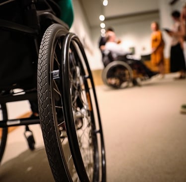
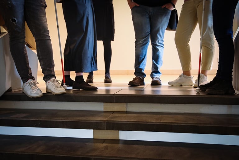
The project lasted nine months. It was the first project of its kind in a museum, and we worked with a team to develop accessibility solutions to improve the museum experience for people with disabilities. These people were our target group, but as we worked, we saw that our solutions also benefit people without disabilities. So we tried to take universal design principles into account at every step. The project was supported by the Lithuanian Ministry of Culture.
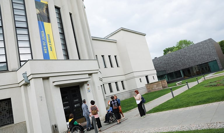
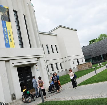
This project, based on consultations, conversations and experiences, sought to reach out to those groups in society for whom the path to culture has long been paved with barriers. Through consultations with people with hearing, visual, physical and mental disabilities, we tried to create a Museum for everyone. The project has created a package of tools to enable free and independent access to the National M.K. Čiurlionis Museum of Art, to move and navigate through the different spaces and exhibition halls, to get to know the content of the museum's exhibitions and, most importantly, to communicate.

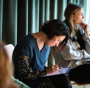
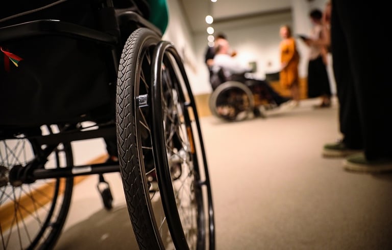
Aim of the project:
to create opportunities for people with disabilities to visit the museum independently without assistance or mediation.
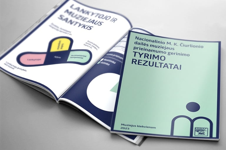
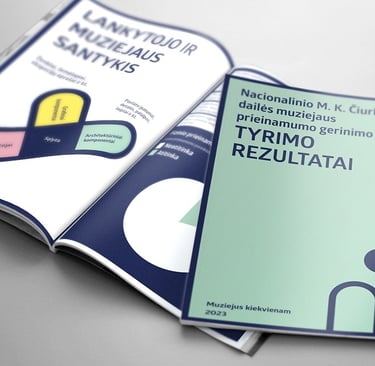
Study on improving the accessibility of the National M. K. Čiurlionis Art Museum.
The study assessed the museum's access, interior, exhibition spaces, and website. It included a survey of museum staff and visitors, invited target groups of visitors envisaged in the project, and monitored the movement of visitors in the museum. Additionally, meetings and consultations were held with other museums that have already implemented or are in the process of implementing accessibility solutions. A map of the current visitor flow was prepared, along with a new map outlining measures to improve accessibility in the museum.
Visual solution for the project.
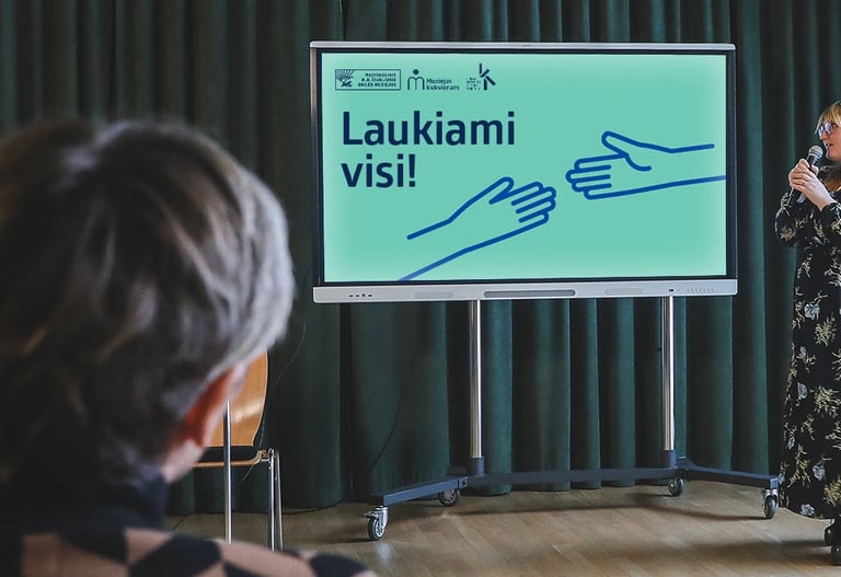
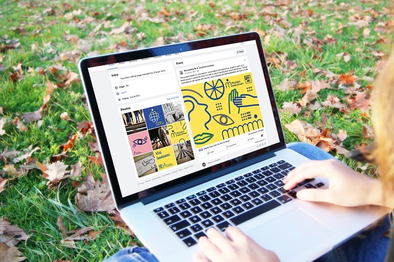
The visual identity for project communication must also meet accessibility requirements. Consideration has been given to colour contrast, legibility and size of fonts, text alignment and paragraph structure. The "Museum for Everyone" sign represents a person in a museum. The external as well as the social advertising was oriented towards an audience of persons with disabilities. It was therefore important to maintain the principles of universal design also here.
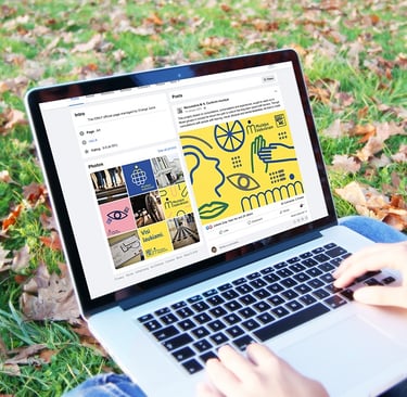
The way-finding and signage system.
Intuitive visitor's wayfinding plan (helping visitors to create mental maps, which makes it easier for them to navigate and reach the desired point). Strategically used landmarks, clear decision points, visual cues helps improve orientation.
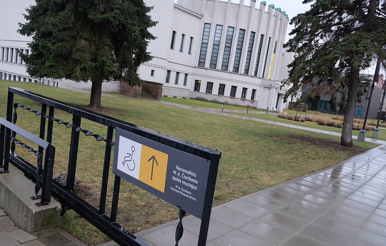
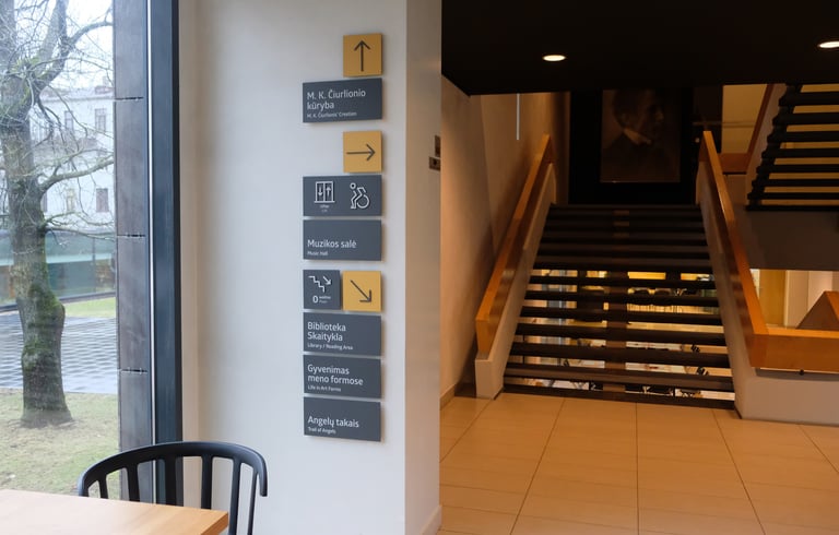
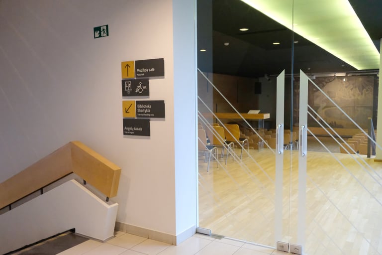
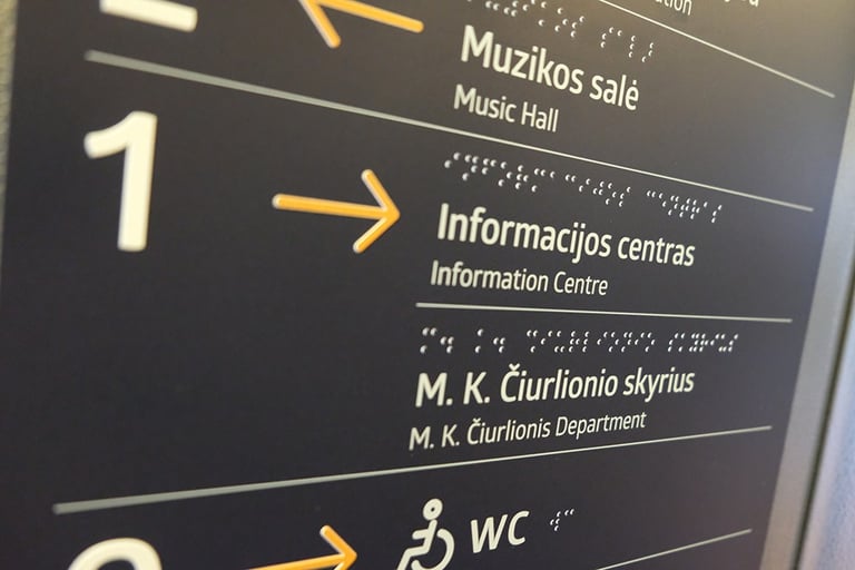
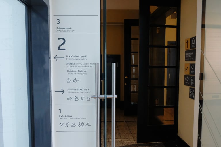
Clear and comprehensible signage. Visitors should always feel informed by the signage of exactly where they are and where they are going. Universal icons, clear legible text, contrasting colours reduce the possibility of getting lost. It is particularly important to consider the positioning of signs at the most difficult points (decision points, road junctions and other locations where visitors are most likely to seek the assistance of hall staff).
Adaptation of exhibits (descriptions, lighting, layout, etc.).
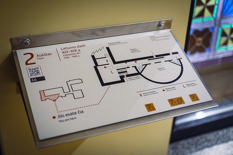
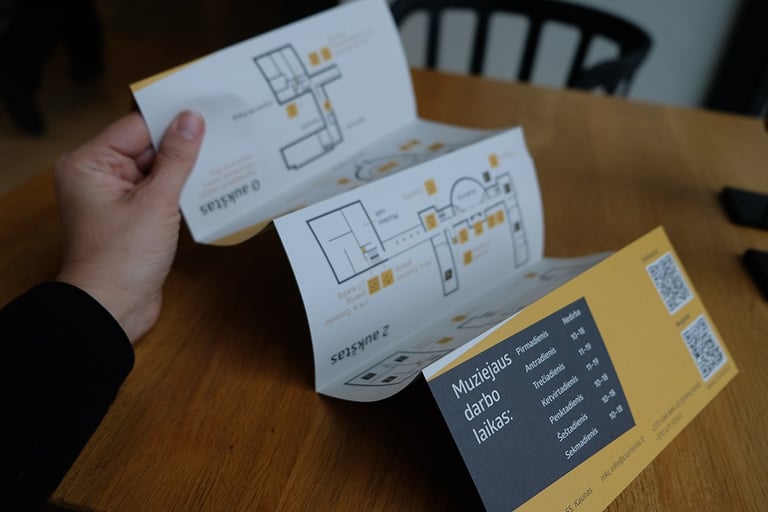
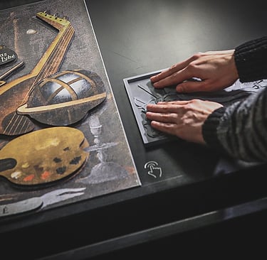
Additional elements to help navigate through the museum (floor plans, paper maps).
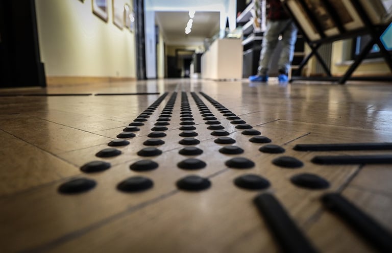
Architectural elements (stands, lifts, guide paths for the blind, ramps).
Technological solutions (audio guide, headphones, QR and NFC codes, etc.).
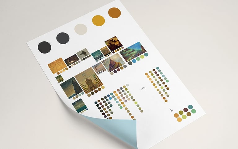
Colours of the museum signage.
Using AI software, the most frequently used colours of M.K. Čiurlionis' paintings were selected. Taking into account the uniqueness of the building and in order to maintain contrast and good visibility, a combination of colours was selected to be used in all elements of the signage system.
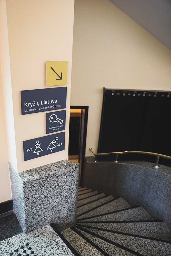
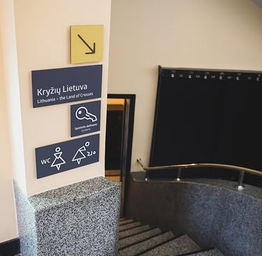
Signage system.
The marking system includes sensory, visual, tactile and combined elements.
The main components of a signage system are: Pre-entry information; Architectural elements and environmental cues; Signage and other information.
Elements of the signage system.
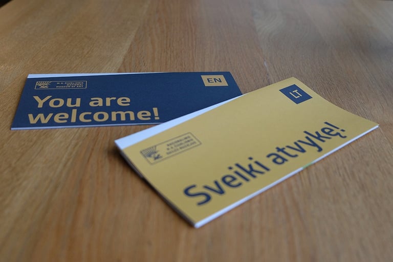
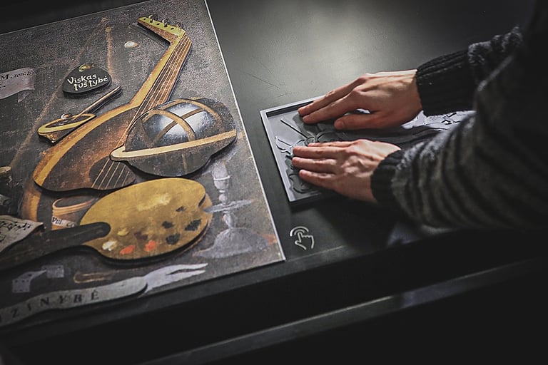
Tactile signs/pointers on handrails; Stair markings in contrasting colours; Outdoor displays; Outdoor directional signs; Flags; Indoor information directional signs; Tactile floor plans of the museum; Light boards; Posters; Stickers on glass partitions; Tactile information boards; Directional information stickers; Leaflet with museum plan.
